Albert Redesign
April 2022
A personal project I worked on to imagine how the course search website for NYU students could be improved.
Contribution: User Research, UI/UX Design
Technologies: Figma
Overview
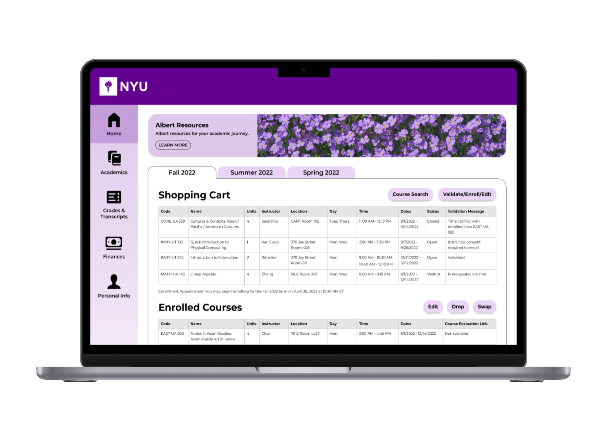
Albert is the portal where NYU students sign up for courses. Many students feel that Albert is confusing and difficult to navigate, making the already stressful task of finding and registering for courses even more challenging.
Initial Research
To get a better understanding of the problem, I researched the difficulties NYU students currently face with Albert’s course search interface. I then looked at course search platforms similar to Albert to see how they addressed these concerns.
User Research
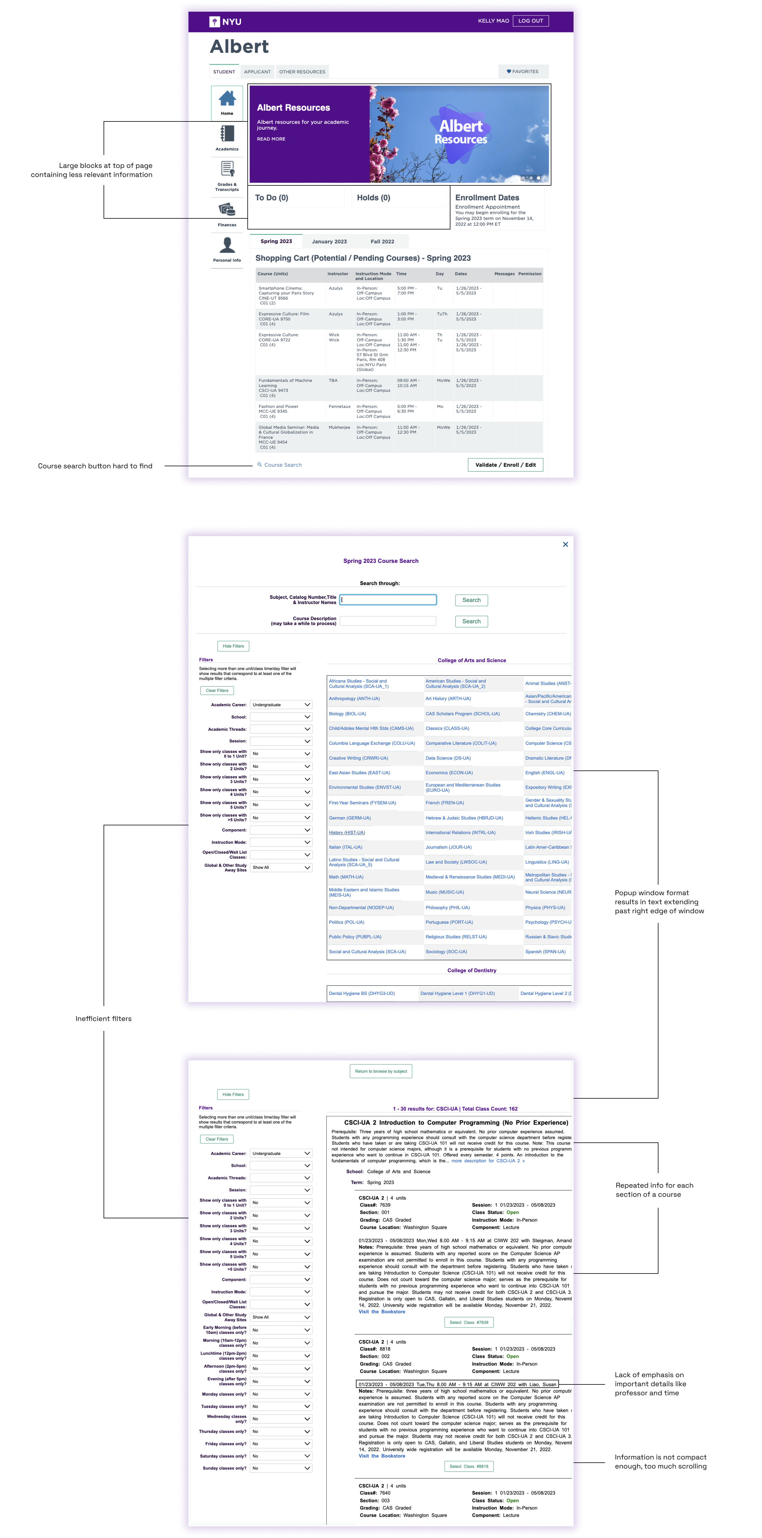
I interviewed my friends and roommates, and looked at complaints students had posted in online communities.
The biggest problems I gathered were the sheer amount and repetition of course result information, the hard-to-use filters, and the lack of emphasis on the important information about each course.
User Persona
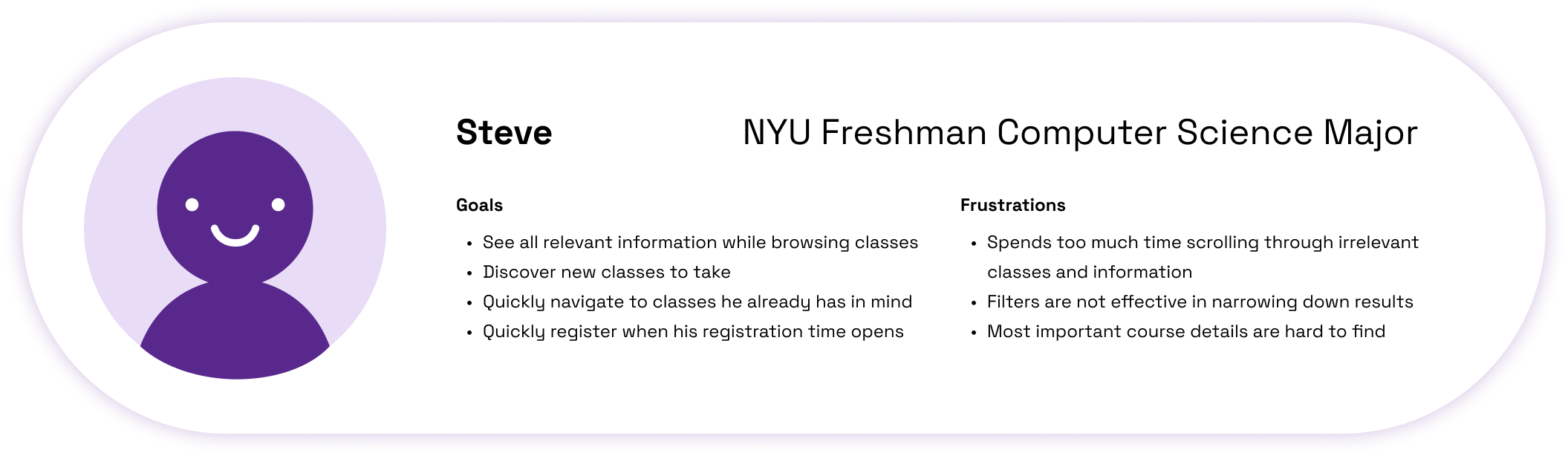
From this, I developed my main goals for the redesign.
- Provide a balance of being able to discover new courses and easily find courses you are looking for.
- Display adequate information about all courses so students can learn what they are about, while organizing the information well so that it’s easy to skim through if users are looking for a specific course.
- Design better systems for filtering classes and add options to save searches for future use.
Researching Other Platforms
I looked at similar systems used by other institutions to see how they address the problems listed above.
The course search systems I looked at were De Anza College, a California community college I took classes at during high school, and edX, a website that offers free online courses from leading educational institutions.
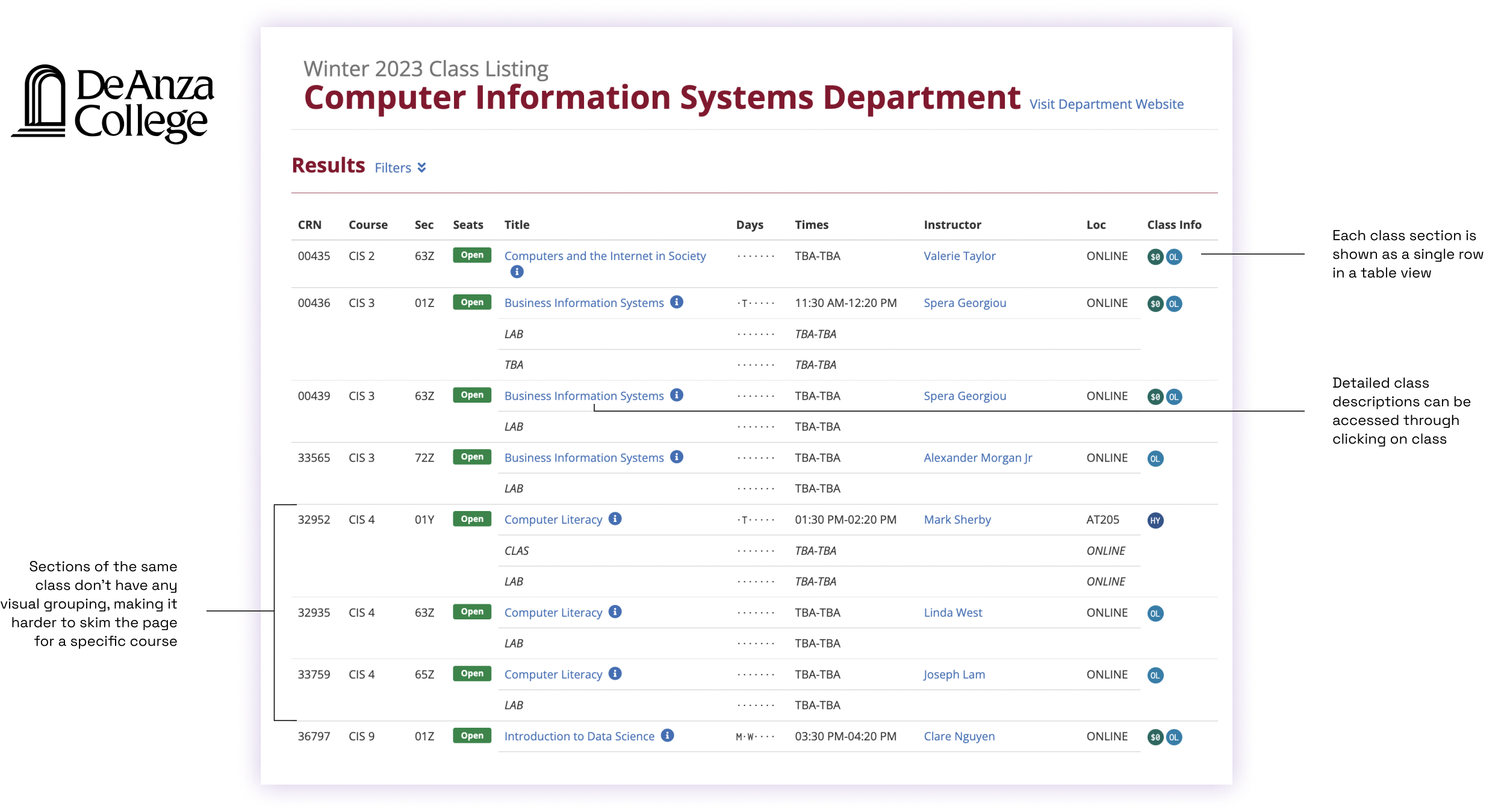
After looking at De Anza’s site, I believe the table view would be a good choice for Albert in order to highlight only the most important information. However, I still think there is value in displaying the course descriptions directly in the search results, so students can learn more about a class without having to open up a new page each time they see an interesting class title. I also would still like to visually group sections of the same course.
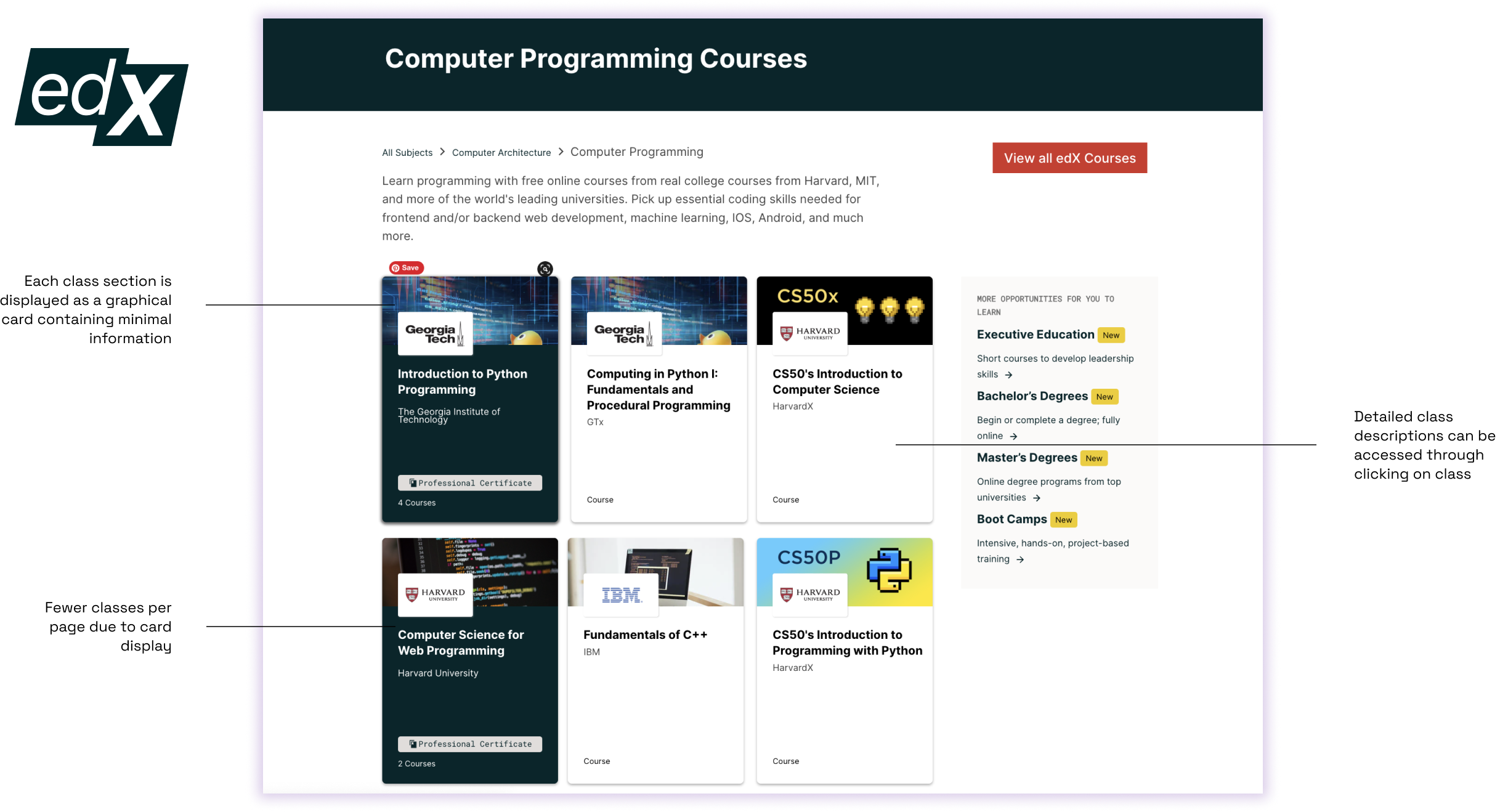
After looking at edX’s site, I think their design decisions wouldn’t suit Albert. edX’s business model relies on the reputation of their partner institution to attract users, so their course search page is more marketing-based, with background images and logos of the universities hosting each class. In addition, their courses are self-paced, so there is no information necessary regarding days and times. On the other hand, students using Albert are not just shopping casually for exciting classes, but also trying to efficiently find required classes.
Design Phase
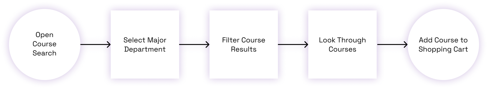
User Flow Diagram
As part of wireframing, I first had to identify the basic features and main user journey.
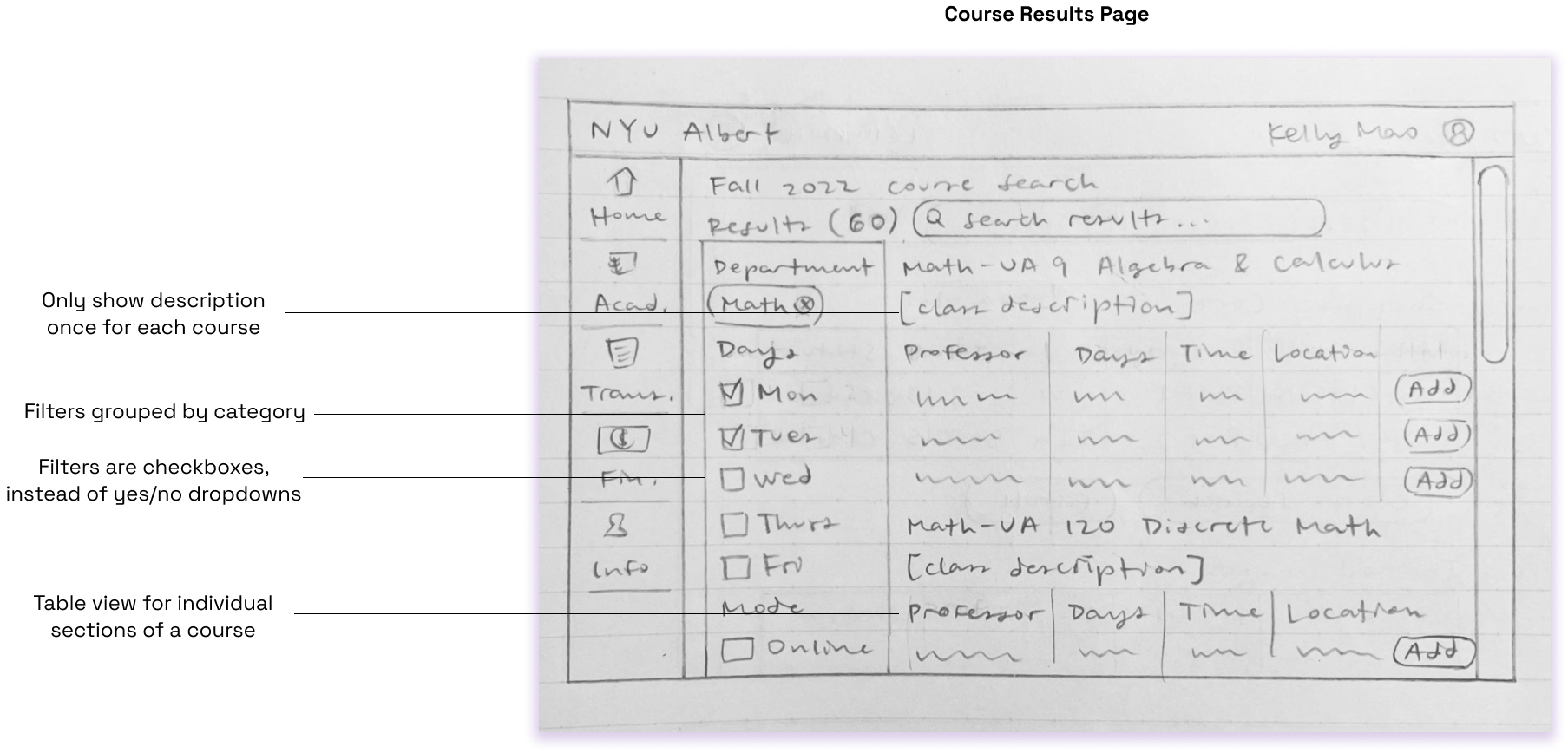
Initial Sketches
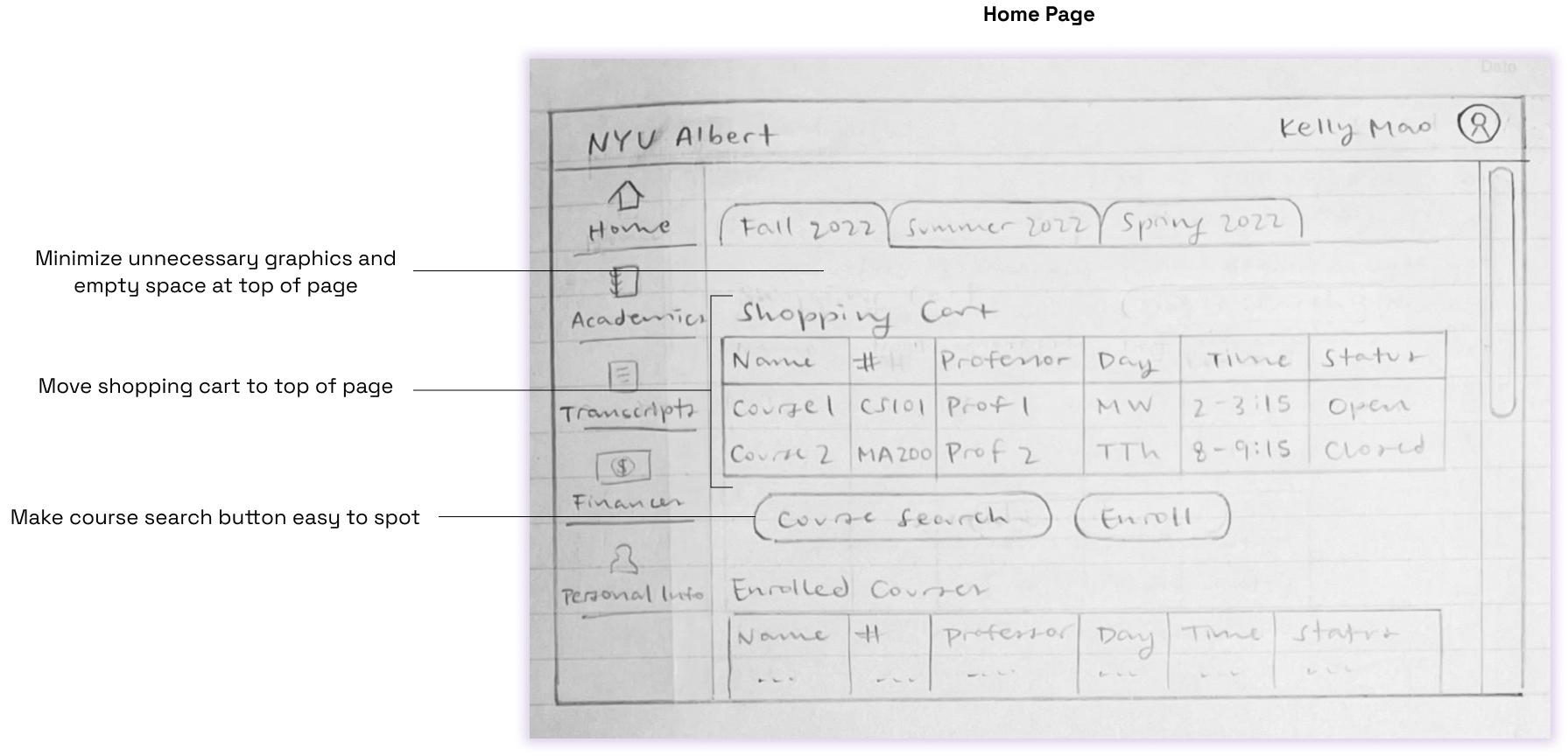
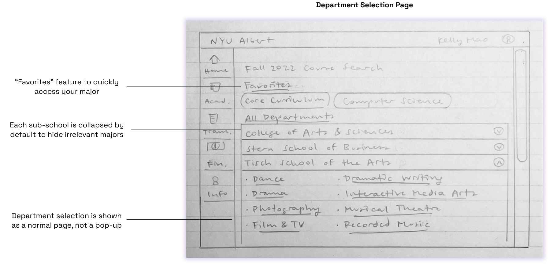
I started the design process by sketching wireframes on paper for the three main screens.
Low-Fidelity Wireframes
I then made a low-fidelity, clickable prototype in Figma.
During prototyping, I decided to add a subheading to each course displaying which college within NYU the course was in, which campus (Washington Square or Brooklyn), and the number of units. Albert currently lists that for each section of the course, leading to repetition.
In this prototype, I still felt that there was a lot of extra information taking up the page, specifically supplementary information about a course such as prerequisites, recommended experience levels, and which requirements it fulfilled. While a student who is considering taking the course should definitely read this information, it is not necessary to display it to every student who is just browsing through the results, and it would lead to each course taking up considerably more space on the page.
For the final design, I split up course information into 2 parts: the course description (displayed by default), and the supplementary information (hidden under the “See notes” button).
Final Design
For my final UI design, I used colors consistent with NYU branding, and added color and drop shadow to buttons to emphasize that they could be interacted with. I think this is especially helpful on the course results page, because there are buttons within each table to add that course. They are greyed out or filled in purple depending on whether the course is closed or not.
Takeaways
After working on this project, I am more confident designing with Figma’s components, auto layout, and prototyping features. It was also interesting because Albert is a tool I use every semester to search for and register for classes, so it was easy for me to empathize with the user on this project and pull from my experience to make decisions throughout the design process. I know that in future projects I will probably not align with the target user, which will make user testing and research all the more necessary.
If this were implemented in real life, some of the key metrics I would look at are:
- The average time between users opening the course search and adding a course to their shopping cart (aiming for shorter times).
- Use rates of features like filtering results and favoriting searches.
- Click rates on “see notes” options for course results.